 Login/Register


Flow Cytometry Data Analysis I: What Different Plots Can Tell You
| OK, so once you have impeccably processed your sample, given them a hand-made, unique staining and ran them in your cytometer without the machine clogging or the computer freezing (I bet you've found that FACSDiva™ is quite temperamental, to honor its name…), then is time to analyze your samples. Easy peasy right? Not quite. | |
| Depending on the complexity of your experiment, it can take you as much time to analyze it as took to actually do it on the bench. At this point, if you are not very experienced in flow cytometry data analysis, or if you are doing the experiment for the first time, then you will have to play around with how to set your gates, what kind of plot to use and decide at the end what is the best way to present your data. |
|
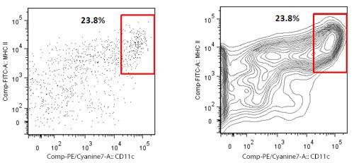
| There are several kinds of dot plots. Many researchers have a fondness for the so called contour plots. Their advantage shows for samples where only a small number of events is collected. Contour plots display the relative frequency of the populations, regardless of the number of events collected. The plots show an enriched dendritic cell (DC) population from mouse spleen on which only a few hundred events could be collected. To the left is a regular dot plot showing all events. To the right is a contour plot with 20 contour lines. The second plot in this case displays better the DC population of interest. | |
 |
|
| However, contour plots are not good in the opposite situation. In the following case, the same DC population is being studied, but in the context of its natural occurrence in the spleen, here it is not enriched. If we keep the previous settings for the contour plots, the population is barely visible. This is because a lot of total events were collected, and the only previous gate is viability. DCs represent only a small fraction of the spleen, so if we gated on this plot we will be excluding a lot of DCs, as they are not optimally displayed. | |
 |
| A possible solution is to show the outliers, as in the middle plot, or use a different plot, such as the pseudocolor, or a regular dot plot. |
| Another kind of widely used graphic is the histogram. A histogram, as opposed to a bivariate graph, displays only one parameter and the number of cells that show a given fluorescence for that parameter. Taking the same example, if you have little experience working with DCs, and were going to define them only based on expression of CD11c, you may end up setting an inaccurate gate. |
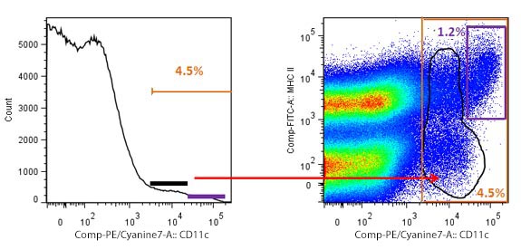 Overestimation of cells due to inaccurate gating. The histogram to the left shows a generous gate of positive events, representing 4.5% of total splenocytes. However, when an MHC II vs CD11c plot is used, a more accurate gating shows that DCs are only 1.2% of the total population. The black gates show the cells that are not DCs, but could be taken as such with suboptimal gating. |
| So, choosing the best way to display your data will help you convince your peers of what you are proposing. You'll avoid, more or less, explicit expressions of disbelief in public regarding the way to identify your cells. By the way, did you notice all my examples are based on DCs? Big time fan, DCs are cool! Don't agree? Dare to let me know:mtam@biolegend.com. Anyway, stay tuned for more tips on gating and how histograms can further mislead your analysis! |


Follow Us